Saturday, September 26, 2009

developing maps

This past week, I have been in the process of figuring out how to map my condition, which is showing what happens when the chaotic and irrationality of Mexico City juxtaposes with the order of the UNAM campus. At first I tried to represent this relationship in regards to the entire central campus.


This became too complicated, and I needed to refine the area that I was mapping. Within this area I had to represent what happens in the moment of transition between the chaotic city and order of the university. To achieve that I began mapping out everything about it, to ananlze what happened and how to represent that.


For the assignment, there are three different maps that we need to create. The first two maps we have to develop have to do with this zone that I am exploring. The first of the maps has to be "a map that must be produced, constructed, a map that is always detachable, connectable, reversible, modifiable, and has multiple entryways and exits and its own lines of flight." The second map, explores the same concept but represented as a perspective, section, axon, ect.

For the first map, I have been exploring how to represent different parts of the grid, in a 3-D manner that can be read and express different ideas from both front and back. The first study I produced was in foam core and could eaily be manipulated, the next challenge was figuring out how to convey the same concept with Bristol paper.


For the second map, I am representing it as a axon showing the reverse figure ground, and extruding those pieces. Here is the current version that I am working on.


On the left side, I allowed the grid of the university campus to raise up while the right side representing Mexico City is a simple line drawing, to provide a contrast, a similar concept I found that I found intreging in the book "X Urbanism" by Mario Gandelsonas. Two of the images I looked at are below.


Sunday, September 20, 2009

mapping

Mapping. Looking at what we map. How we map. Mapping is completely open. There is no limit to what can be mapped. There is also no direction in which a map has to be read.

The image below is a link to a podcast and article that was on Chicago Public Radio; it explores the topic of mapping the world in regard to smell, sound, touch, and taste. The world mapped by the five senses. I thought it was interesting as we begin to explore how to map our concepts of the university. The image is a map by Denis Wood who used a "brush loaded with ink at the location of every street light in the neighborhood to suggest the pools of light people swim through when walking the streets of Boylan Heights at night".


Here is a short funny video that I found about mapping and google earth.

In regards to the concept that I will be exploring for assignment 3: Site as Text, I will be looking at conditions that occur along the main campus and the intersection of Mexico City. I will be mapping the relationship that exists between the chaotic nature of Mexico City and the order of UNAM’s main campus

Saturday, September 19, 2009

Boîte-en-Valise

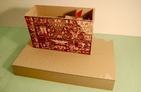
I continued to develop the spatial qualities of the box of UNAM and producing a model more in scale and constricting the model to the volume of UNAM library.

For the final model for assignment 2, Boîte-en-Valise, I started to explore the relationship between the box of the library and the base that it sits on. I wanted each space to read here on their own but work together and create moments where both spaces were experienced simultaneously.


below is the base when the top is removed

Wednesday, September 16, 2009

UNAM: exploring the box

For the second assignment, we were asked to use Duchamp and Cornell Boîte-en-Valise as inspirations for exploring the volume of the UNAM library. The library is a box, just as Duchamps containers, whose only limitation in terms of special qualities is the form of the container. In this assignment we had to figure out what could happen inside the volumes, but to keep in mind that the box is like a book, the exterior hides but also expresses what could happen on the inside.

I began by looking at the images of Duchamp and Cornell, and began sketching how they divided the volume and how the spatial qualities were expressed. The image on the right is Cornells Boîte-en-Valise.


By looking at the facades of the UNAM library, I extracted graphic elements and tried to represent that in model.


Wednesday, September 9, 2009

the story of a droplet


Yesterday I presented my "book of water," our professor asked us to sit down read our book to the critics. If I were to read my book to you, it would go along the lines of; this is a story of the journey that a singular water droplet takes as it explores all different water forms that exist in its life. The story begins as mist or condensation from there a single droplet appears. More water droplets appear as it begins to rain, this is where you would probably run inside and take cover. As the rain intensifies puddles start to form on the ground and the rain takes a turn for the worst and it begins to hail. The hail starts to overflow into the rivers and streams, causing the water to gush in every direction. Larger pools of water appear from the overflow and ripples of rain encompass them. From the ripples comes a single droplet and transforms back to the mist. The cycle of the water droplet is complete but never ending, you can start the book again if you wish.


As I produced this final book, I continued to develop it further and to see how far I could push the manipulation of plastic water bottles to achieve the desired effect I was striving for. In this final production I used mostly plexi glass as its pages, by using sandpaper on the plexi I was able to produce a blurry effect, that produce translucent pages.


Although it was only about a week project I feel a strong connection to my book. I thoroughly enjoyed the entire process design process of the book, the ability to be extremely conceptual and the actually production of the book.

Thursday, September 3, 2009

the book of water

For our first project in studio, we each choose one book from Peter Greenaway’s Prospero's Books to make a conceptual model of. I choose “The Book of Water.”

“This is a waterproof-covered book which has lost its colour by much contact with water. It is full of investigative drawings and exploratory text written on many different thicknesses of paper. There are drawings of every conceivable watery association - seas, tempests, rain, snow, clouds, lakes, waterfalls, streams, canals, water-mills, shipwrecks, floods and tears. As the pages are turned, the watery elements are often animated. There are rippling waves and slanting storms. Rivers and cataracts flow and bubble. Plans of hydraulic machinery and maps of weather-forecasting flicker with arrows, symbols and agitated diagrams. The drawings are all made by one hand. Perhaps this is a lost collection of drawings by da Vinci bound into a book by the King of France at Ambois and bought by the Milanese Dukes to give to Prospero as a wedding present.”

I choose this book,” because I found it intriguing, because water is pure. It is powerful and malleable taking every conceivable form. Water can destroy us but water is something that we cannot live without. When I began to think about how I wanted to produce this book, I was interested in the relationship that exist between water in a pure form and water is the form that society has degraded it to be. Plastic bottles. Millions are produced and used a day by society, thrown away without a second thought. It is how we consume water. The shortage of water is about to be the international community most pressing issue in the rapidly approaching future.


The first concept model on the left, that I explored creating was to completely encase the cover in plastic to represent the relationship between plastic bottles and water. The texture, light, and the effect that I found in the plastic was appealing, and it influenced the progress of my design. Another cover idea on the right was an attempt at seeing water though our eyes, and to physically trying to put water into the book.


I began to collect water bottle of all different shapes and sizes, and playing with cutting the plastic different ways, using the top the bottoms, and even the labels into my pages to represent the energy of water in all its forms.